là một chương trình vẽ vector, thường được sử dụng để vẽ hình minh hoạ, hoạt hình, biểu đồ, đồ thị. Adobe Illustrator được dùng để thiết kế : như thiết kế những sản phẩm trong ngành thiết kế quảng cáo, thiết kế in ấn, thiết kế logo, thiết kế bản hiệu, thiết kế thời trang, thiết kế thiệp mời, Tạo các sản phẩm tờ rơi, Cataloge, Card Visit, Broucher, Profile,vẽ hoạt hình, tích hợp chuyển động cho Flash...Adobe Illustrator ưu diểm là dễ dàng thay đổi và trao đổi dữ liệu ,kích thước file nhẹ, dễ dàng tương thích với Photoshop, Corel Draw, và hỗ trợ in ấn rất tốt.
Hôm nay, trung tâm TIN HỌC KEY xin giới thiệu đến các bạn một hệ thống bài tập thực hành vẽ các đối tượng trong Adobe illustrator (Ai) (phiên bản tiếng anh, theo: vectips.com) có hướng dẫn chi tiết các bước thực hiện cụ thể để các bạn dễ dàng thực hành theo. Hôm nay chúng ta sẽ học bài 3: Creating Seamless Textures and Seamless Backgrounds in Illustrator. Hy vọng hệ thống bài học này sẽ mang lại cho bạn những kiến thức hữu ích trong quá trình bạn học Adobe illustrator (Ai).
Chúc các bạn thành công!
Adding Texture in Illustrator
If you have been working with illustrator for a while, you probably know that you can easily drop in a texture as an image, set it to multiply, and you’re good to go. One of the great things about using the techniques in this tutorial is you can easily create a seamless texture or background without having to add a mask out nor make sure it will fit your artwork properly. Additionally, we’ll use the Appearance panel to quickly create a unique graphic style–this should make it easy to apply the effects to other text and vector objects. 
Raster Effects
If you are familiar with some of the texture effects and filters in Photoshop, you will feel right at home with this technique. For these effects, I keep the Document Raster Effects Settings at 300 ppi. You can change this resolution by going Effect > Document Raster Effect Settings.
Step 1
Create a new document and create a rectangle with the Rectangle tool (M). 
Step 2
Take off the stroke and fill the rectangle with a linear gradient. Change the first color stop in the gradient to a greenish blue color, change the second color stop to a darker greenish blue color, and change the Angle to -90. 
Step 3
From the Appearance panel, open the pop-up menu and choose Add New Fill. Choose the topmost fill from the Appearance panel and change the fill to a gray color. 
Step 4
With the new gray fill selected in the Appearance panel, go Effect > Texture > Grain. In the Grain dialog, change the Intensity to 90, the Contrast to 50, and the Grain Type to Sprinkles. Then click ok. From the Appearance panel, press the arrow to the left of the title and from the sub-list, click on the Opacity link and change the Blending Mode to Multiply.

Step 5
From the pop-up menu of the Appearance panel, add another New Fill like before. Select the top fill, and change the gradient to a Radial Gradient. Then set the color to white on both stops and change the Opacity of the first white color stop to 40 and the second to 0. From the sub-menu of the new radial gradient, click Opacity, and change the Blending mode to Overlay as outlined in the images below. 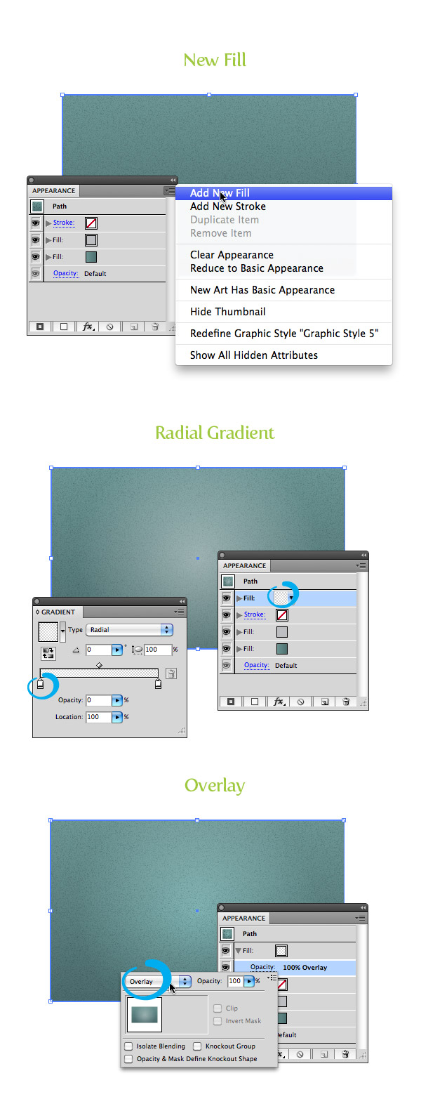
Step 6
That does it for the seamless background texture, but we can also add similar textures to our copy, all while keeping the text still editable! (Isn’t the Appearance Panel awesome?!) To start, select the Type tool (T), and type some text. I used the the font for Museo Slab 900 for the “Raster” text. Next, using the Color panel, remove the stroke and fill from the text.

Step 7
From the Appearance panel, click the pop-menu, choose Add New Fill and fill it with a linear gradient. Change the first color stop to white, the second to a light gray, and change the Angle to -90.

Step 8
Create another new fill from the Appearance panel and fill it with a gray color. Then, select the new gray fill, and go to Effect > Texture > Texturizer. In the Texturizer dialog, change the texture to Burlap, the Scaling to 200, the Relief to 50, and the Light to Top. Change the fill’s Blending Mode to Multiply and set the Opacity to 5.

Step 9
Select the bottom linear gradient in the Appearance panel and go Effect > Stylize > Drop Shadow. In the Drop Shadow dialog box, change theOpacity to 60, the X and Y Offset to 0, and the Blur to 1. You should now have a light texture effect and drop shadow on your text! 
Step 10
For the “Effects” text, I used Museo Sans 300 (I’m kinda obsessed with the Museo Family). Again, type out some text, then using the Color panel, remove the stroke and fill. Then, create a new fill from the Appearance panel, and add a a linear gradient to the text, chaging the first color stop to black and the second color stop a gray color. Next, change the Angle to -90. Create another new fill, make sure you are editing the last fill list item in the Appearance panel, change the fill to a lighter color than your background, and go Effect > Distort & Transform > Transform. In the Transform Effect dialog, change the Vertical Move to 1. That does it for the raster texture example! How did yours turn out? 
Playing Around
Get creative. It’s fun to play around with different effects to see what new textures you can create. Below is taken from the Vectips tutorial Create An Editable Stitched Label Type Treatment with some basic textures added.

Pattern Fills
Creating this technique is pretty similar to the raster effects technique. Really, these textures are just seamless pattern fills that come stock with Illustrator, but they can create some pretty interesting results.
Step 1
The initial steps are almost exactly the same as the previous raster example. Create a rectangle and remove and stroke. From the Gradient panel, fill it with a linear gradient using greenish yellow colored color stops, and change the angle to -90.

Step 2
Instead of using an effect for the next step, we are going to use some of Illustrator’s stock pattern swatches. From the Swatches panel, press theSwatch Library Menu button at the bottom left side of the panel, and choose Patterns > Basic Graphics > Basic Graphics_Textures. With the rectangle selected, choose a new fill from the Appearance panel, select the topmost fill, and fill it with the Bird Feet swatch from the library we just opened. (An easy way to see the name of the swatches in a library is to choose Large List View from the pop-up menu of the swatch panel.) After you have filled the new fill with the Bird Feet swatch, change the Blending mode to Overlay.

Step 3
To finish off the background, create a new fill, and fill it with the same white radial gradient from Step 5 of the Raster technique. That’s it for the pattern fill technique! Pretty easy, right?

Step 4
The text treatment is pretty similar to the raster image. To create the “Pattern” text, I did the same as step 10 from the raster image. I used Susa Heavy for the font, and using the Appearance panel, I filled it with a dark gray linear gradient, added a new fill, offset the new fill, and changed the offset fill to a lighter background color.

Step 5
Below the “Pattern” text, I added 2 simple paths with the Line Segment tool (/). To do this, simply draw a path that is the length of the text. Go toWindow > Stroke to open your Stroke panel, and change the stroke to 1 pt and the color to a gray color. Create another path directly below the first, and change the stroke color to a light background color.

Step 6
For the “Swatch” text, I used Museo Slab 900. Remove any stroke and fill and from the Appearance panel and add a new fill. Change the new fill to a linear gradient with the first color stop white, the second a darker yellow color, and change the Angle to -90. With the new fill selected, go Effects > Stylize > Drop Shadow. In the Drop Shadow dialog box, change the Opacity to 50, X and Y Offset to 0, and the Blur to .5 px.

Step 7
Create a new fill from the Appearance panel and fill it with a linear gradient. Then, change the first color stop to a light yellow color, change the second to the same darker yellow color in the previous step, and set the Angle to -90. With the new fill selected, go Effects > Path > Offset Path. In the Offset Oath dialog, change the Offset to -1 px.

Playing Around
These are really fun to play with. Take your background texture that you just made, find the Bird Fill item, and change it with any of the Basic Graphics_Textures swatches to see what you come up with! Also try combining a couple of different pattern fills on the same background to see what cool effects that makes.

Combining Raster Effects and Pattern Fills
This technique is probably my favorite. It’s fun to explore and play around with all the different results. Basically we are combining both the raster and pattern fill techniques. This is pretty similar, so if you had no trouble with the previous techniques, you will have no problem with these!
Step 1
I’m not going to go into too much detail because you have already done the initial steps in the first two samples. Basically, create a rectangle, fill it with a red linear gradient, create a Sprinkle grain pattern, and create a radial white gradient.

Step 2
Add another fill in the Appearance panel and choose the “Diamond” pattern fill from the Basic Graphic_Textures. Set the Blending Mode of the new pattern fill to Overlay and change the Opacity to 50. 
Step 3
For the “Combo” type, I used RadioTime for the font and used the same gray gradient and offset from the previous examples. The secondary text is simply Museo Sans 300 with a yellow fill.

Playing Around
Like before, this is good time to play around and see what different texture treatment you can come up with!

Creating Graphic Styles
So now that we have all these wonderful textures created, we can apply the effect to other artwork and text. Instead of creating the effect every time, we can just create a Graphic Style.
Step 1
To create a graphic style, simply select you texture and press the New Graphic Style Button in the Graphic Style panel. Seriously, it’s that easy. Now select some text or another object and click you new style in the Graphic Styles panel and your all set! You can even create graphic styles for each of the text treatments we created.

Step 2
Occasionally, I’ll adjust the texture in the Appearance panel to include other elements. In buttons examples below, I added an offset fill of 1 px and added a drop shadow to the fill. The background texture is just a Graphic Pen fill (Effect > Sketch > Graphic Pen), and the icons have the same treatment as my text is some of the texture examples.

Playing Around
Now experiment with the graphic styles on other text, UI, and vector objects. I hope you have fun creating all sorts of unique seamless textures and backgrounds using these techniques. Feel free to share any of your cool creations by leaving a comment below!

Nếu bạn có nhu cầu học khóa học Adobe illustrator (Ai) vui lòng NHẤP VÀO ĐÂY để xem chi tiết về khóa học hoặc NHẤP VÀO ĐÂY để gửi thắc mắc về khóa học của bạn cho chúng tôi.
Những bài viết có nội dung liên quan khác:
Phím tắt trong phần mềm Illustrator (AI)
Giáo trình illustrator cs6 tiếng việt
Hệ thống bài học Adobe illustrator (Ai) (tiếng Việt) có hướng dẫn chi tiết - Bài 1
Hệ thống bài học Adobe illustrator (Ai) có hướng dẫn chi tiết - Bài 1 (Phiên bản gốc)
Hệ thống bài học Adobe illustrator (Ai) có hướng dẫn chi tiết - Bài 2 (Phiên bản gốc)
Trung tâm TIN HỌC KEY
ĐC : 203-205 Lê Trọng Tấn – Sơn Kỳ - Tân Phú – TPHCM
ĐT : (028) 22 152 521
Web : key.com.vn
Địa chỉ: 203 - 205 Lê Trọng Tấn, P. Sơn Kỳ, Q. Tân Phú, TP. HCM.
Điện thoại: (028) 22 152 521
Website: key.com.vn - Email: key@key.com.vn
Địa chỉ: 765-767A (Số mới: 558-560A) Nguyễn Ảnh Thủ, P. Tân Chánh Hiệp, Q. 12, TP. HCM.
Điện thoại: (028) 2242 2244
Website: key.com.vn - Email: key@key.com.vn