là một chương trình vẽ vector, thường được sử dụng để vẽ hình minh hoạ, hoạt hình, biểu đồ, đồ thị. Adobe Illustrator được dùng để thiết kế : như thiết kế những sản phẩm trong ngành thiết kế quảng cáo, thiết kế in ấn, thiết kế logo, thiết kế bản hiệu, thiết kế thời trang, thiết kế thiệp mời, Tạo các sản phẩm tờ rơi, Cataloge, Card Visit, Broucher, Profile,vẽ hoạt hình, tích hợp chuyển động cho Flash...Adobe Illustrator ưu diểm là dễ dàng thay đổi và trao đổi dữ liệu ,kích thước file nhẹ, dễ dàng tương thích với Photoshop, Corel Draw, và hỗ trợ in ấn rất tốt.
Hôm nay, trung tâm TIN HỌC KEY xin giới thiệu đến các bạn một hệ thống bài tập thực hành vẽ các đối tượng trong Adobe illustrator (Ai) (phiên bản tiếng anh, theo: vectips.com) có hướng dẫn chi tiết các bước thực hiện cụ thể để các bạn dễ dàng thực hành theo. Hôm nay chúng ta sẽ học bài13: How to Create a Donut Font Style That Will Have Your Clients Drooling. Hy vọng hệ thống bài học này sẽ mang lại cho bạn những kiến thức hữu ích trong quá trình bạn học Adobe illustrator (Ai).
Chúc các bạn thành công!
How to Create a Donut Font Style That Will Have Your Clients Drooling
Final Image

Step 1
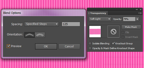
In order to begin, I like to set up my background layer first. Create a new document that is longer than it is wide (in this case 8″ x 4″, or so). Use the Rectangle Tool (M) to create a shape larger than the artboard. I chose a light pink for the fill color. Using a darker pink and the Line Segment Tool (\), I drew a line on the left of the artboard, Copied (Control-C) and Pasted (Control-V) it on the right and used the Blend Tool (W), seen below to create a simple striped background at 125 Steps (your step number may vary depending on the width of your line segments, size of your document, and how thin or thick you’d like the stripes to be). Reduce the opacity of the Blend Group in the Transparency panel to 79%, and change its Blend Mode to Soft Light.
Step 2
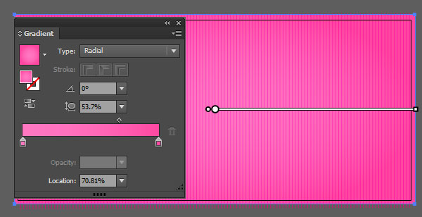
Select the rectangle you drew in Step 1, and apply a Radial Gradient using the Gradient Tool (G). The gradient pictured below goes from light pink to dark pink. Whatever your color theme, keep the darker color to the edges of the gradient.
Step 3
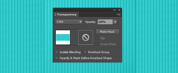
In case you’d like to change your background color quickly, for whatever reason, draw another rectangle over the artboard, set the fill to your chosen color, and the Blend Mode in the Transparency panel to Color.
Step 4
Let’s draw some letters. Use the Pencil Tool (N) and carefully draw simple, rounded letters. If you set the Pencil Tool’s Options’ Fidelity to Smoothyour paths will smooth out and be drawn more perfectly. To do so, hit Enter with the Pencil Tool selected and, in the options’ panel that pops up, slide the Fidelity slider all the way to the right. Set the Stroke Weight in the Stroke panel to 12-20 points (something thick, but not so thick that the letter’s details aren’t easily made out). Use a tan, brown, or yellow color for your donut base. Keep your letters rounded by selecting roundedCaps and Corners in the Strokes panel.

Step 5
Draw all of your letters, and align them to the bottom by Selecting your letters and hitting Vertical Align Right (last icon in the top row) in theAlign panel. Alternatively, you can arrange with the Selection Tool (V). Expand the stroked paths in Object > Expand so your letters become closed shapes.

Step 6
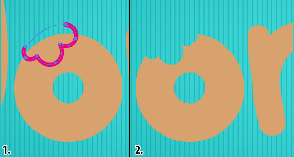
Using the Pencil Tool or Pen Tool (P), draw a scalloped shape overlapping the O, D, and T, and be sure to close the shape. Select both the letter and new shape, and hit Minus Front in the Pathfinder panel. Now you’ve successfully taken a bite out of some of your donut letters.
Step 7
Using a bright color (in this case pink), draw flower-like shapes on rounded letters with hole (O’s, D’s, B’s, P’s, etc) and dripping shapes on the tops of other letters. For the rounded shapes with holes in the center select both the icing shape and the donut letter. Use the Shape Builder Tool (Shift-M) to select the central hole. Deselect both and Delete the central hole. Also note below, the additional bite shapes taken out of other letters during Step 6.

Step 8
Let’s start rendering the first donut letter. Copy and Paste the D and set the Fill to Null and the Stroke to light brown using the Color Palette, and then change the stroke’s weight to 3pt in the Stroke panel. In the Transparency panel, set the Blend Mode to Soft Light.
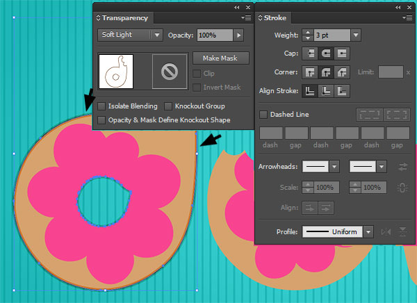
Step 9
Copy and Paste the D again and set the Fill to Null and the Stroke to the same light brown (something darker than the donut base color in case you’re not using tan) as done in Step 8. Set the stroke’s weight to 0.5pt and keep the Blend Mode at Normal.
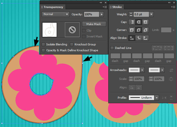
Step 10
I’ve hidden the icing shape in the Layers panel so we can focus on the cake portion of the donut letters. Select the D, Copy, Paste, and Align it (with the first D), and go to Effect > Stylize > Inner Glow. In the dialog box that pops up, set the Mode to Screen, Opacity to 60%, and Blur to 0.2 in.
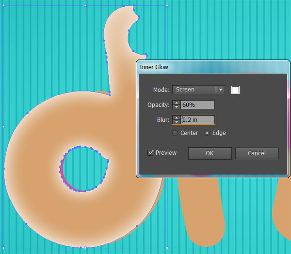
Step 11
The second effect you’ll add to the shape from Step 10 is a Drop Shadow. Do so by going to Effect > Stylize > Drop Shadow. Set the Mode to Color Burn, Opacity to 75%, X Offset to 0.1 in, Y Offset to 0.02 in, Blur to 0.1 in, and the Color to Brown.
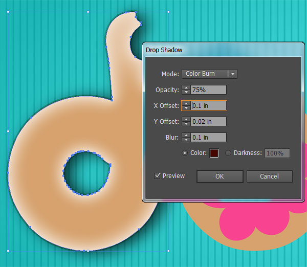
Step 12
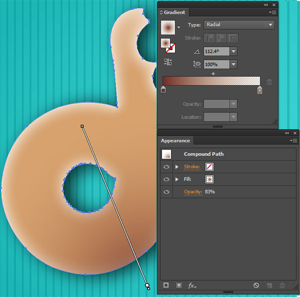
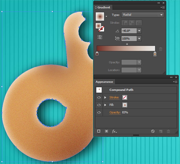
Copy and Paste the base D shape again. Using the Gradient Tool, set the fill to a Radial Gradient going from Brown at 100% to Tan at 0%, and place the radial gradient on the lower right of the letter. Reduce the Opacity of the shape to 83% in the Transparency panel.
Step 13
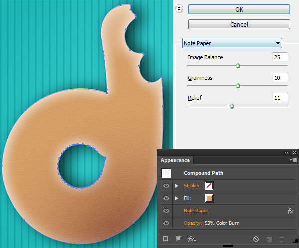
Paste the D for a third time (make sure each D is aligned with the base shape), and set the shape’s Blend Mode to Color Burn and Opacity to 53% in the Transparency panel. Go to Effect > Sketch > Note Paper, and apply this effect (seen below) with Image Balance at 25, Graininess at 10, andRelief at 11. The fill color of this shape is tan; it’s the same as the base color of the donut letters.
Step 14
Paste the letter D for a fourth time and set the fill color to a Linear Gradient using the Gradient palette, going from tan to a darker tan color. Set the Opacity to 50% and the Blend Mode to Soft Light in the Transparency panel.
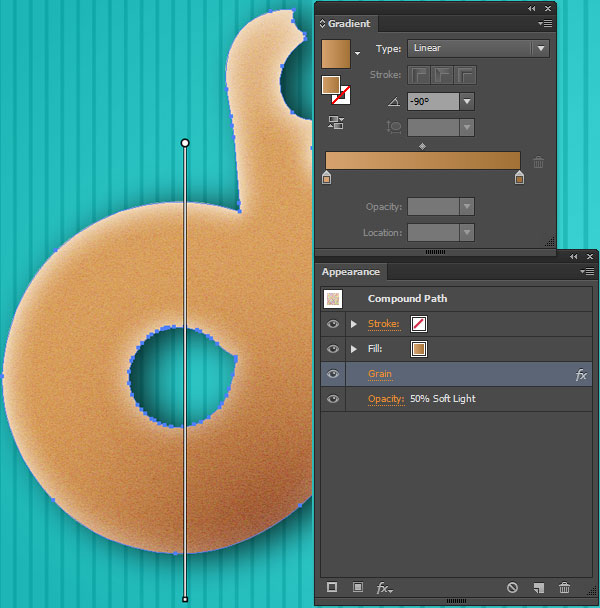
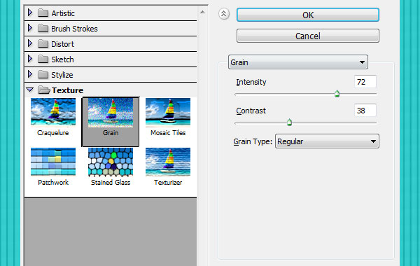
Add a Grain effect by going to Effect > Texture > Grain and setting the Intensity to 72, Contrast to 38, and Grain Type to Regular.
Step 15
Once again (for the fifth time since Step 10), Paste the D and Align it with the rest of the letter’s layered shapes. Then apply a Radial Gradient as the fill color. This gradient is the same as the one from Step 12 but will be placed at the top left of the D.
NHẤP VÀO ĐÂY để xem các bước tiếp theo ....
TRUNG TÂM TIN HỌC KEY
ĐC: 203-205 Lê Trọng Tấn - Sơn Kỳ - Tân Phú - TP HCM
ĐT: (028) 22 152 521
