là một chương trình vẽ vector, thường được sử dụng để vẽ hình minh hoạ, hoạt hình, biểu đồ, đồ thị. Adobe Illustrator được dùng để thiết kế : như thiết kế những sản phẩm trong ngành thiết kế quảng cáo, thiết kế in ấn, thiết kế logo, thiết kế bản hiệu, thiết kế thời trang, thiết kế thiệp mời, Tạo các sản phẩm tờ rơi, Cataloge, Card Visit, Broucher, Profile,vẽ hoạt hình, tích hợp chuyển động cho Flash...Adobe Illustrator ưu diểm là dễ dàng thay đổi và trao đổi dữ liệu ,kích thước file nhẹ, dễ dàng tương thích với Photoshop, Corel Draw, và hỗ trợ in ấn rất tốt.
Hôm nay, trung tâm TIN HỌC KEY xin giới thiệu đến các bạn một hệ thống bài tập thực hành vẽ các đối tượng trong Adobe illustrator (Ai) (phiên bản tiếng anh, theo: vectips.com) có hướng dẫn chi tiết các bước thực hiện cụ thể để các bạn dễ dàng thực hành theo. Hôm nay chúng ta sẽ học bài 9: All the Rage: 3D Style Retro Text Effect Tutorial. Hy vọng hệ thống bài học này sẽ mang lại cho bạn những kiến thức hữu ích trong quá trình bạn học Adobe illustrator (Ai).
Chúc các bạn thành công!
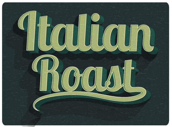
Final Image
Step 1
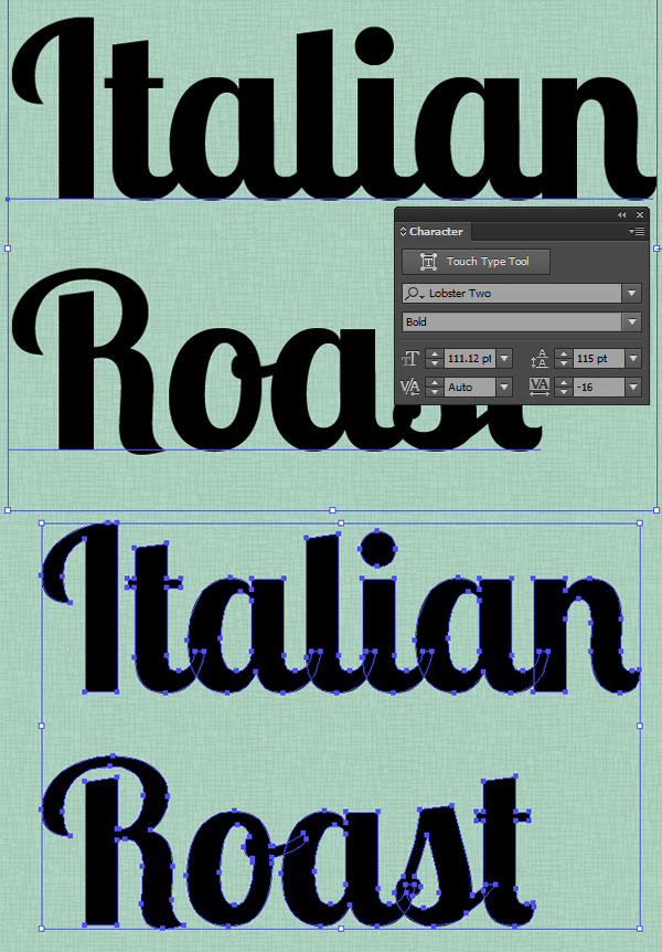
Start with your font of choice. In this case, I chose Lobster 2, but also recommend Lobster, ChunkFive, or Birra. Write out your text or title with theType Tool (T). I chose “Italian Roast”, as it’s the name of a type of coffee, and I find this text effect goes well with all things coffee, packaging, and cafe related. Expand your text to outlines under Object, and then Ungroup your text.
Step 2
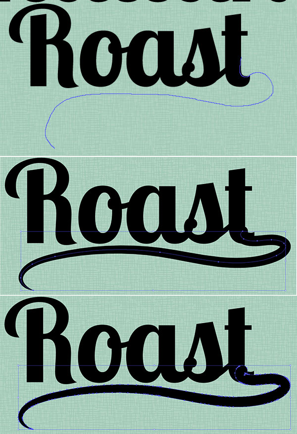
I think the word “Roast” needs a flourish. Using the Pencil Tool (N) I drew a swooping line from the letter “T” that moves to the left and stops below the “R”. Apply a thick stroke to the path in the Stroke panel. Use the Width Tool (Shift – W) to taper the tail of the flourish by placing points with the tool near the end of the tail and dragging our mouse to make the path thinner at that end. Once you’ve got the flourish in a position and shape that you enjoy, Expand it in Object and Group together with your word (in this case it’s been Grouped with “Roast”).
Step 3
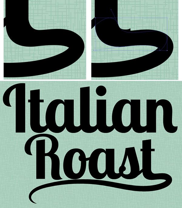
In order to make sure the flourish drawn in the previous step fits in with the text group seamlessly, Zoom (Z) in so you can work on the details of the final letter. I’ve used the Pen Tool (P) in order to draw a shape that hides the little kick on the end of the “T” and flows into the expanded flourish path. This may be easier to do if you’re using a graphics tablet and the Pencil Tool (N) if you want your curves to flow with quickly drawn lines.
Step 4
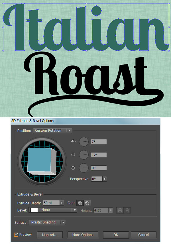
I’ll mainly focus on the word “Italian” in this tutorial, since the process for the text treatment is the same for both word groups. Select the “Italian” group and hit Unite in the Pathfinder panel. With the newly compound shape selected, go to Effect > 3D > Extrude & Bevel and apply the following attributes:
X Axis: 7°
Y Axis: 12°
Z Axis: 0°
Extrude Depth: 50pt
Surface: Plastic Shading
Step 5
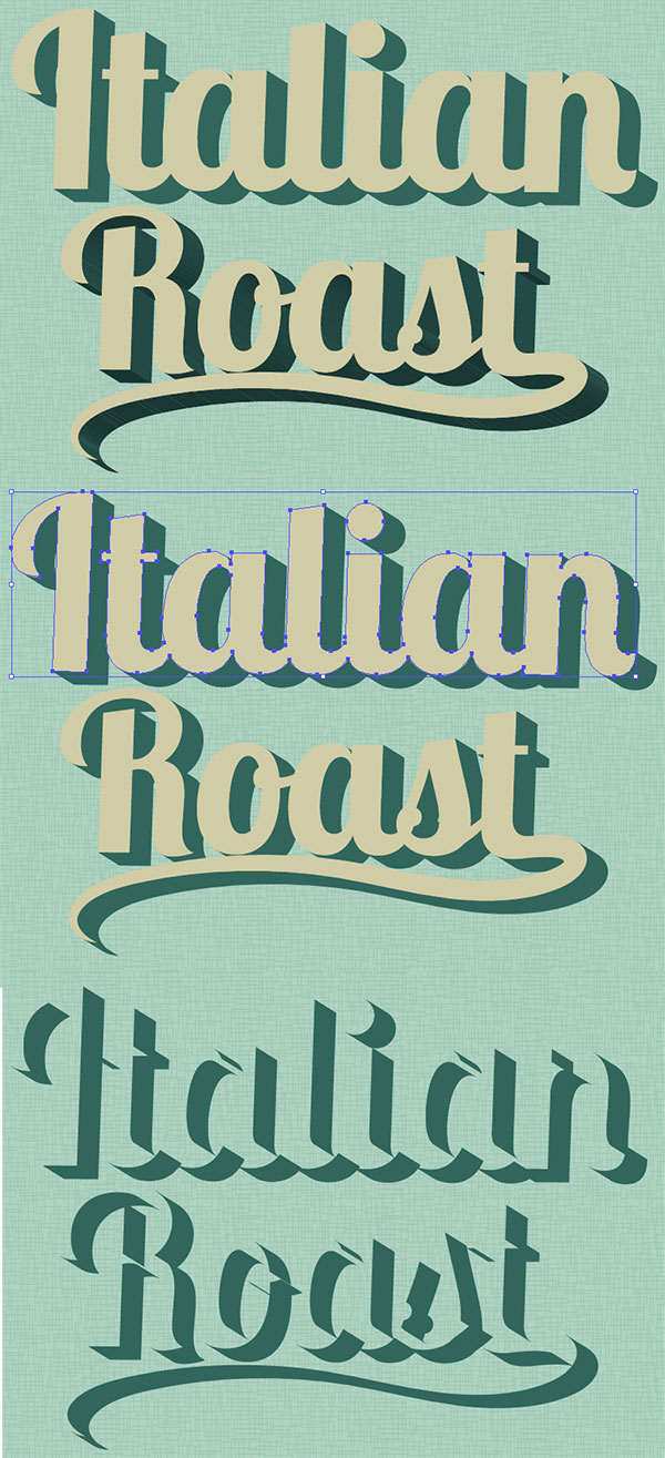
With your new 3D text selected, Expand Appearance under Object and Ungroup. Select the face of the text (the letters without their 3D counterpart) and set the fill color to a light color: cream, pale mint, etc. Group together the 3D components of lettering. We’ll be adjusting the fill colors of those pieces in the following steps.
Step 6
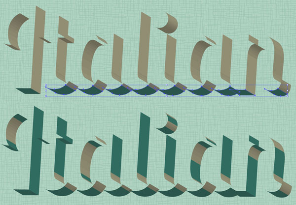
You’ll need two colors for the 3D components of your text. In this case I chose teal and darker teal. Using the Direct Selection Tool (A), select the bottom components of the 3D text and apply the darkest shadow color as the fill color (see below). For anything that is on the right side of each letter and not a part of a curve, apply the lighter shadow color as the fill color (see below).
Step 7
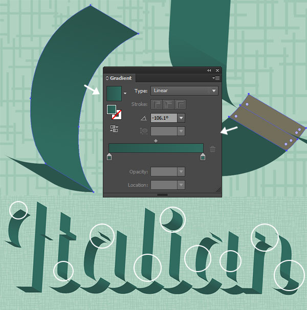
For curving shapes in the 3D text, you’ll apply a Linear Gradient going from the lighter shadow color to the darker shadow color using the Gradientpanel to sort out the gradient’s angle. I’ve circled the sections of the 3D portion of the text where the gradients were placed. Once satisfied with the shadow colors and gradients of the 3D text, make sure it’s all Grouped together and Unhide the rest of your text. Repeat Steps 4-7 on any other text you may have in your artboard.
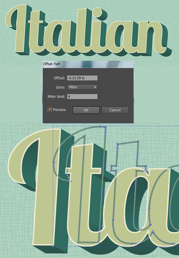
Step 8
Select the face of your text (the group from Step 5), Copy (Control – C), Paste (Control – V), and go to Object > Path > Offset Path… where you’ll apply a -1px Offset. With both the copied text face and the offset objet selected, hit Minus Front in the Pathfinder panel. For the fill color, choose something lighter than the text’s face color (light cream, seen below). Copy and Paste this outline shape and apply a color darker than the mint used for the face of the text.
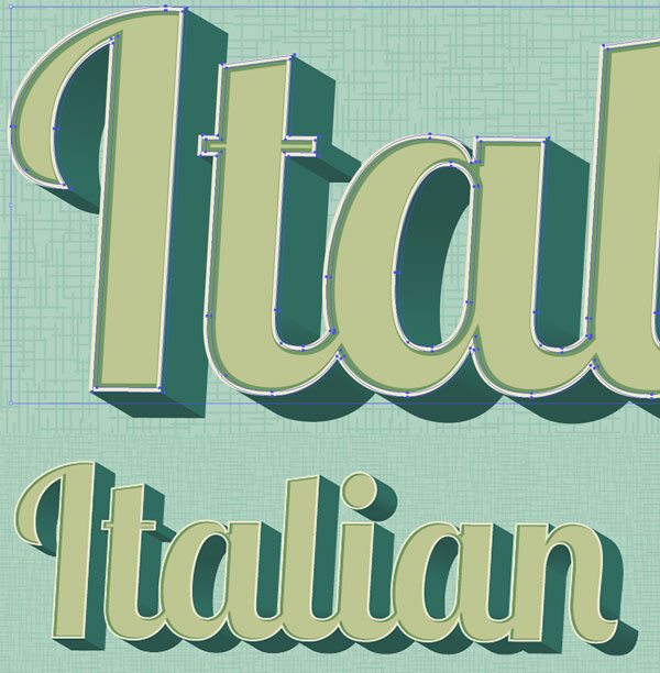
Step 9
Place this second outline shape to the right of the light cream outline shape and below it in the Layers panel. Copy, Paste, and Align (in the Alignpanel) the text’s face group with itself. With the copied face and the green outline shape selected, hit Control-7 in order to create a Clipping Mask. Repeat Steps 8-9 on your other text (if applicable).
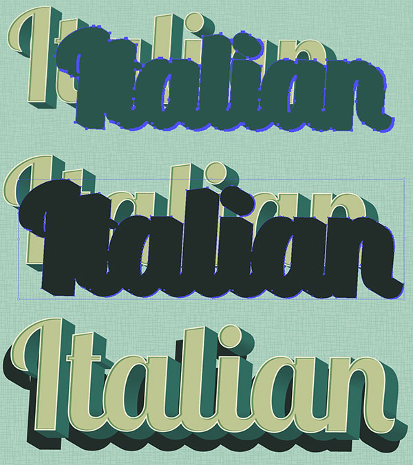
Step 10
Group your text together, Copy, and Paste. Unite the Pasted text group in Pathfinder. Set the fill color to an even darker color (in this case a very dark teal) and place it behind the text group in the Layers panel. Move it to the left and downward (see below) so it forms a bit of a drop shadow.
Step 11
The background I’ve been using (whose texture was not covered in this tutorial, since it’s not a part of the final piece) is much too light for this color scheme. Using the Rounded Rectangle Tool, I drew a rounded rectangle over the artboard, behind the text groups, in a green-gray color.
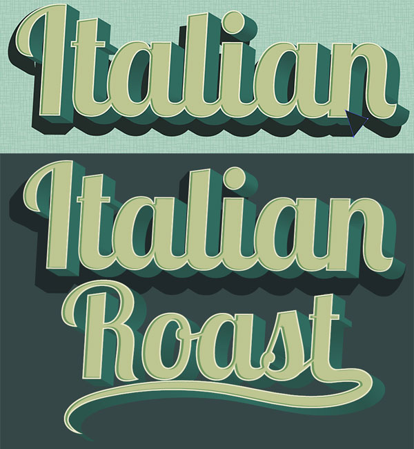
Step 12
Reapeat Step 10 and give any other text a simple drop shadow.

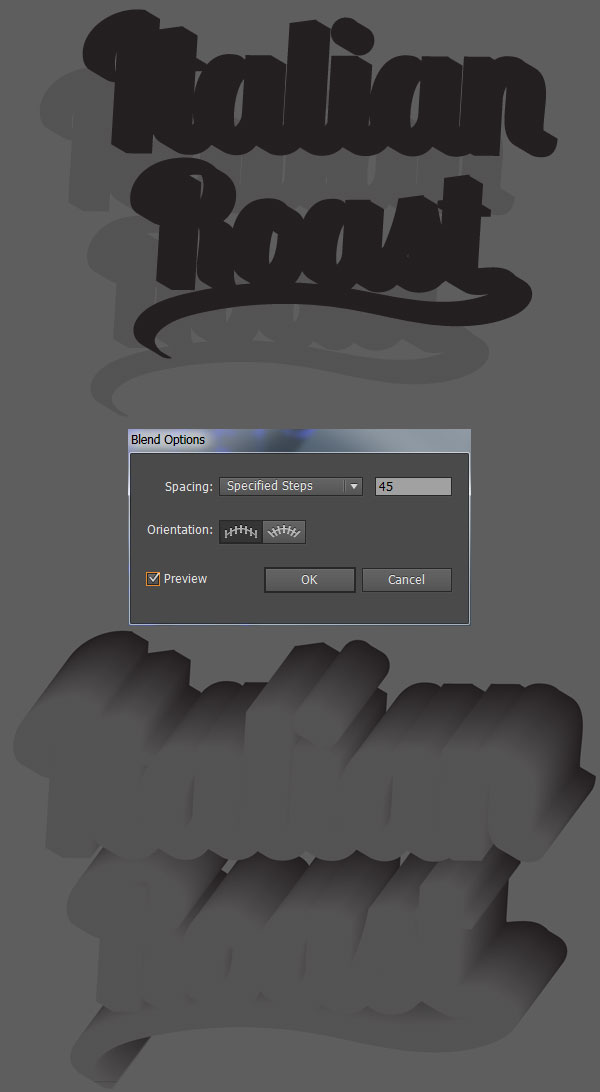
Step 13
Copy and Paste the drop shadows twice into two separate groupes. Reduce the Opacity of the second group to 10% in the Transparency panel. Make sure it has been moved to the left and downward from the first group. Use the Blend Tool (W) to apply a smooth blend of 45 Steps. Place this blend group behind the drop shadows and text.
Step 14
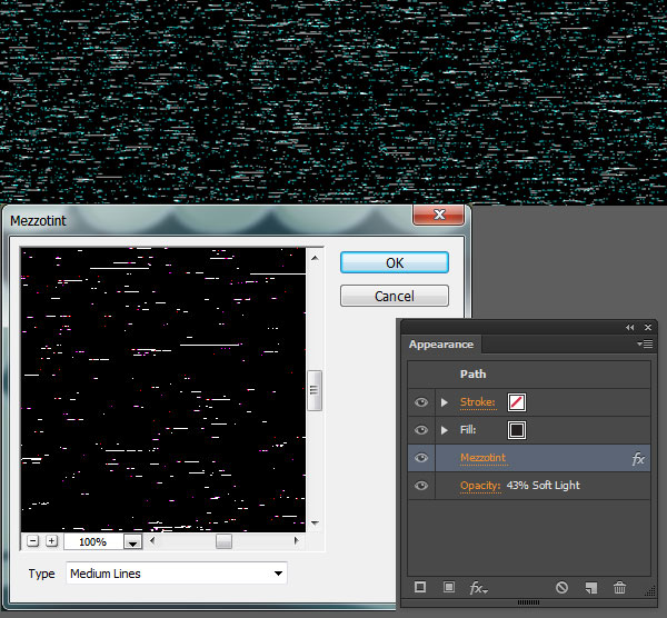
For the texture used over the top of the final piece, Copy and Paste the background rounded rectangle, but make sure it’s above the other layers in the Layers panel. Set the fill color to dark gray and go to Effect > Pixelate > Mezzotint. Choose Medium Lines as the Mezzotint type. In theTransparency panel, set the Blend Mode to Soft Light and Opacity to 43%.
Great Job, You’re Done!
You’ve done it! Your retro text has been given a kick in the right direction. Play with long shadow shapes behind the text, add in other flourishes, effects, and designs in order to take this fairly simple text effect to the next level.

Nếu bạn có nhu cầu học khóa học Adobe illustrator (Ai) vui lòng NHẤP VÀO ĐÂY để xem chi tiết về khóa học hoặc NHẤP VÀO ĐÂY để gửi thắc mắc về khóa học của bạn cho chúng tôi.
Những bài viết có nội dung liên quan khác:
Phím tắt trong phần mềm Illustrator (AI)
Giáo trình illustrator cs6 tiếng việt
Hệ thống bài học Adobe illustrator (Ai) (tiếng Việt) có hướng dẫn chi tiết - Bài 1
Hệ thống bài học Adobe illustrator (Ai) có hướng dẫn chi tiết - Bài 1 (Phiên bản gốc)
Hệ thống bài học Adobe illustrator (Ai) có hướng dẫn chi tiết - Bài 2 (Phiên bản gốc)
Hệ thống bài học Adobe illustrator (Ai) có hướng dẫn chi tiết - Bài 3 (Phiên bản gốc)
Hệ thống bài học Adobe illustrator (Ai) có hướng dẫn chi tiết - Bài 4 (Phiên bản gốc)
Hệ thống bài học Adobe illustrator (Ai) có hướng dẫn chi tiết - Bài 5 (Phiên bản gốc)
Hệ thống bài học Adobe illustrator (Ai) có hướng dẫn chi tiết - Bài 6 (Phiên bản gốc) Phần 1
Hệ thống bài học Adobe illustrator (Ai) có hướng dẫn chi tiết - Bài 6 (Phiên bản gốc) Phần 2
Hệ thống bài học Adobe illustrator (Ai) có hướng dẫn chi tiết - Bài 7 (Phiên bản gốc)
Hệ thống bài học Adobe illustrator (Ai) có hướng dẫn chi tiết - Bài 8 (Phiên bản gốc)
Trung tâm TIN HỌC KEY
ĐC : 203-205 Lê Trọng Tấn – Sơn Kỳ - Tân Phú – TPHCM
ĐT : (028) 22 152 521
Web : key.com.vn
Địa chỉ: 203 - 205 Lê Trọng Tấn, P. Sơn Kỳ, Q. Tân Phú, TP. HCM.
Điện thoại: (028) 22 152 521
Website: key.com.vn - Email: [email protected]
Địa chỉ: 765-767A (Số mới: 558-560A) Nguyễn Ảnh Thủ, P. Tân Chánh Hiệp, Q. 12, TP. HCM.
Điện thoại: (028) 2242 2244
Website: key.com.vn - Email: [email protected]